
What once felt like a golden age of useful software has slowly turned into a parade of renewal notices. Many popular apps still offer free downloads, but the features that made them feel truly indispensable—better editing tools, offline access, cleaner interfaces, deeper analytics, and fewer interruptions—have steadily migrated behind monthly or annual plans. The shift rarely happened in one dramatic moment. It arrived a feature at a time, until everyday software started to resemble another household bill.
These 18 apps capture that pattern especially well. Some are still excellent. Some are arguably better than ever. But together, they show how note-taking, fitness, design, writing, weather, and photo tools became part of a broader subscription economy that many users now find hard to ignore.
Evernote
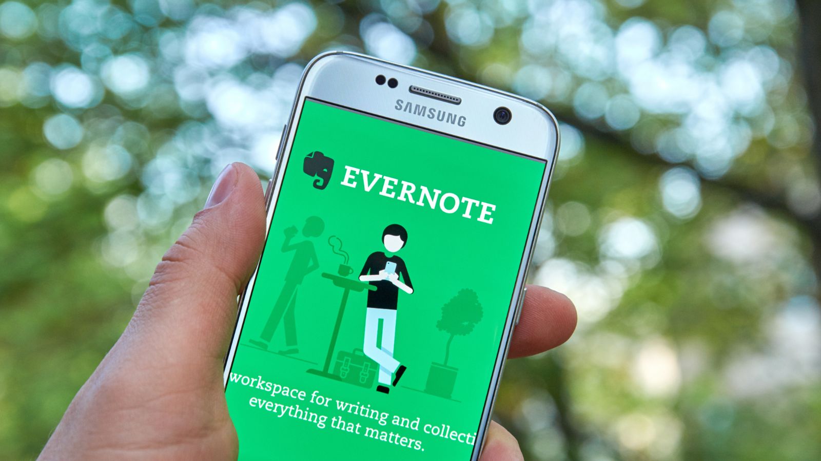
Evernote was once the default answer to a simple digital problem: where should all the useful bits of life go? It handled clipped articles, scanned receipts, lecture notes, meeting agendas, and half-finished ideas with a kind of calm efficiency that made the service feel bigger than any one device. For years, that convenience helped create real loyalty. People built filing systems inside it, stored years of work in it, and treated the elephant logo almost like a promise that digital clutter could be tamed.
That emotional bond is exactly why the modern pricing shift lands so hard. Evernote’s free plan is now tightly limited, with a cap on notes and notebooks, and its individual plans have been reworked again. For someone who once used it casually for everything from grocery lists to tax documents, the product can now feel less like a broad everyday notebook and more like a service that keeps nudging heavier users toward paid tiers. The app still does a lot well, but its value now arrives with a much sharper meter running in the background.
MyFitnessPal
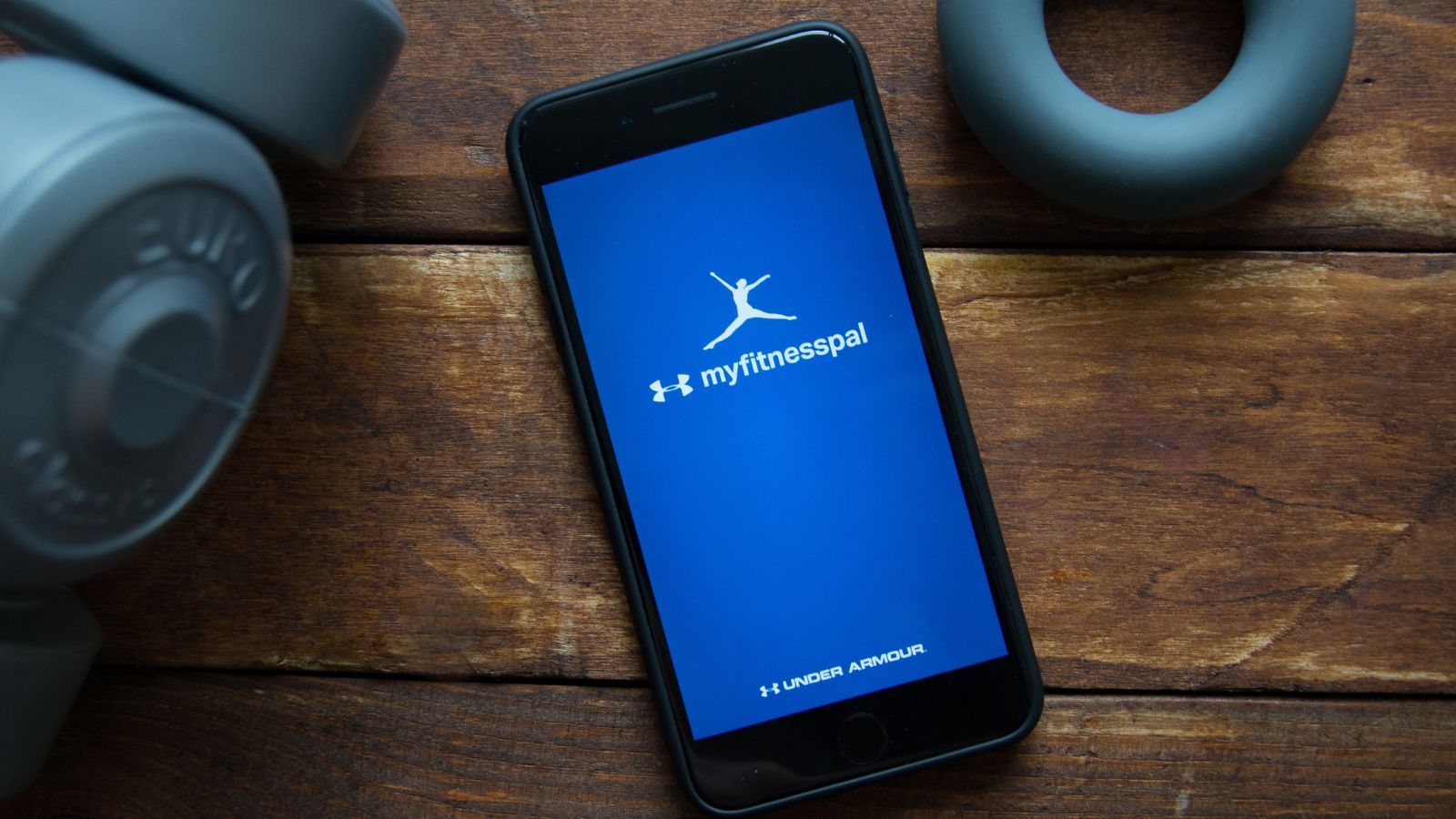
Few apps embedded themselves into daily routine the way MyFitnessPal did. It was not glamorous, but it was useful in exactly the way people needed. Logging breakfast, checking macros, scanning packaged food, and watching trends over time turned the app into a quiet accountability partner. For many users, the barcode scanner was the magic trick. Standing in a supermarket aisle and scanning a cereal box was faster than typing ingredients, and that speed made the app feel practical rather than preachy.
That is why the decision to put barcode scanning behind Premium hit such a nerve. When a signature convenience stops being part of the free habit, the whole experience changes. The app still offers food tracking and a large nutrition database, but a tool many people associated with everyday ease now belongs to the paid tier. Once an app crosses that line, it often starts to feel as if the subscription is no longer for extras; it is for the version people thought they were already using. That distinction matters more than companies sometimes realize.
Strava
Strava earned affection by making exercise feel social without turning it into a lecture. A run was not just mileage; it became a route, a story, a set of splits, a photo, a bit of neighborhood bragging, and maybe a segment battle with a friend. For runners and cyclists especially, the app managed to sit at the intersection of training log and community square. That combination gave it a hold few fitness apps can match, because it became part performance tool and part identity marker.
The subscription era changed the emotional balance. The free version still records activity and keeps the social feed alive, but many of the deeper features—advanced analysis, routes, segment leaderboards, and training tools—sit behind the paid plan. Price increases only made that divide more visible. For casual users, Strava can still feel generous enough. For committed athletes, though, the app increasingly suggests that the richest version of the experience exists on the other side of a recurring bill. The result is familiar: affection remains, but so does a low-grade sense that the best parts have been moved farther away.
Duolingo
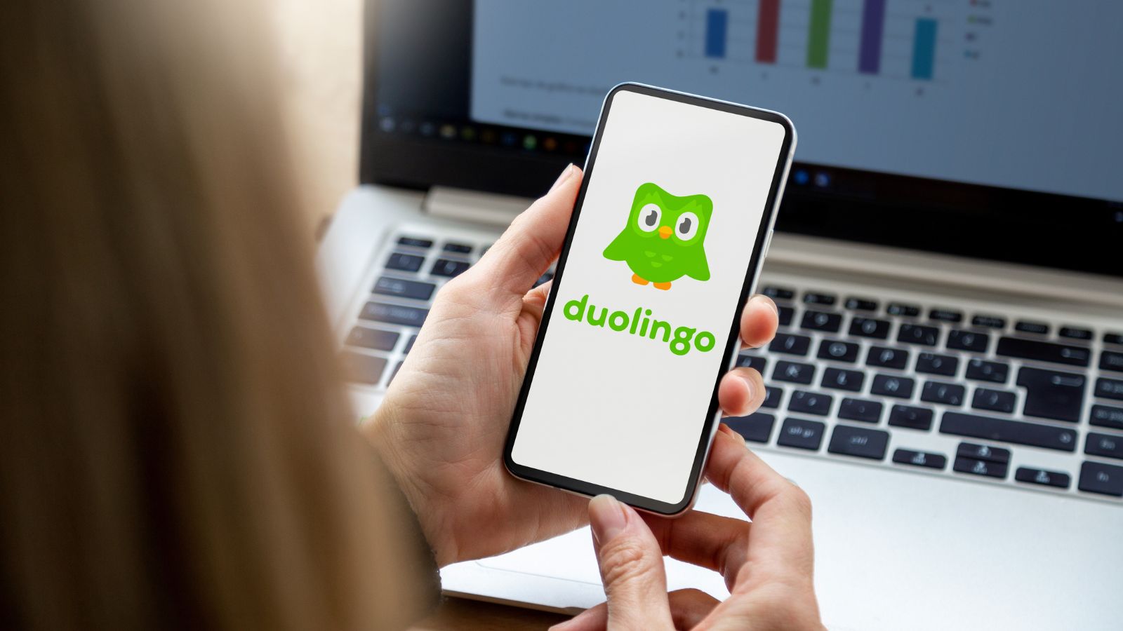
Duolingo remains one of the clearest examples of a modern freemium giant that still knows how to charm people. Its lessons are short, colorful, and psychologically effective at keeping streaks alive. The owl mascot became internet-famous for a reason: the app makes language learning feel less like homework and more like a daily ritual that can survive a crowded schedule. For millions, it removed the intimidation factor from starting Spanish, French, Japanese, or another language in the first place.
Yet Duolingo also shows how a free app can gradually make paid access feel increasingly attractive. Super removes ads and hearts-related friction, while Max layers on AI-driven features. None of that makes the free version vanish, but it does change the texture of using it. The more seriously someone studies, the more interruptions and constraints begin to feel like nudges toward subscription. That model has worked extremely well for the company, but it also captures a larger trend: apps do not have to become technically paywalled to make users feel that full participation now comes with a monthly cost attached.
Calm
Calm built its reputation on softness. Open the app and the whole environment seems designed to lower the volume of the day: quiet visuals, slow narration, bedtime stories, breathing exercises, and music intended to nudge the mind toward stillness. It became one of the most recognizable wellness apps in the world because it understood something simple: many people do not want a complicated mental-health tool at 11 p.m. They want something that feels like a hand on the shoulder and a room with the lights turned down.
That polished gentleness, however, now lives most fully inside Calm Premium. The company’s paid plan unlocks the full library, including a large collection of Sleep Stories and guided content, while the free experience acts more like a sampler. For users who originally arrived looking for a daily reset rather than another subscription commitment, that can feel like a contradiction. The app promises relief from stress, but accessing the fuller version of that relief means adding another annual charge to the same digital life that already feels crowded with them. The irony is subtle, but it is hard to miss.
Headspace
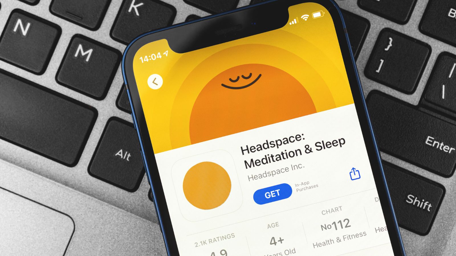
Headspace succeeded by making meditation feel approachable instead of mystical. Its clean design, gentle voice work, and structured programs turned mindfulness into something that could fit between meetings, after a rough commute, or before sleep. It appealed especially to beginners because it did not demand a spiritual reinvention. It offered practical calm in digestible sessions, and that made it feel less like a philosophy product and more like a health utility people could actually stick with.
Over time, though, Headspace also became a clear example of how subscription logic settles into wellness apps. The company offers monthly and annual plans, plus family and student options, and the free entry point is largely a runway into that paid ecosystem. That model makes business sense, especially for regularly updated content libraries, but it changes the relationship with the app. Someone who came for a few breathing exercises can start to feel as though the real version lives behind a membership. Once that happens, the app stops feeling like a small daily aid and starts behaving more like another service contract—one that happens to come wrapped in soothing colors.
Canva
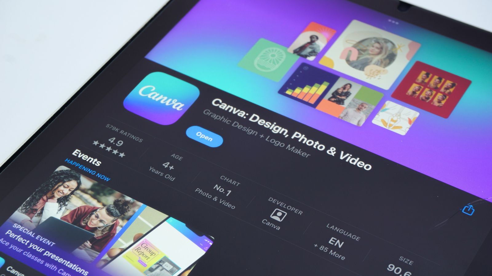
Canva felt like a small miracle when it took off. It let non-designers make decent-looking presentations, posters, menus, invitations, and social graphics without needing formal training or expensive desktop software. That mattered because it turned design from a specialist task into an everyday one. Teachers, freelancers, students, nonprofit staff, and small business owners could all get something polished on screen quickly. For a long time, the company’s appeal was rooted in that sense of democratic ease: drag, drop, export, done.
But Canva’s expanding premium layers changed the emotional math. Pro and Teams put more of the polished templates, brand tools, collaboration features, and AI additions behind paid plans, and the company’s pricing changes for some Teams users drew especially sharp attention. When an app becomes central to work, even modest recurring fees begin to feel less optional. Canva is still genuinely useful, and that is part of the problem: once it becomes embedded in school, marketing, or office workflows, the line between “nice to have” and “must keep paying for” gets blurry fast. Familiarity turns into dependence, and dependence makes subscriptions harder to shrug off.
Adobe Lightroom
Lightroom earned loyalty by doing something many photo apps never managed: it gave everyday users a path into genuinely serious editing. On mobile especially, it helped people move beyond quick filters into cleaner color control, stronger organization, and a more deliberate photographic workflow. For creators trying to make phone shots look intentional rather than accidental, it became a trusted bridge between convenience and craft. That bridge mattered because it gave users room to grow without immediately forcing them onto a desktop workstation.
The catch, of course, is that growth increasingly points toward subscription. Adobe’s mobile premium features include tools such as selective adjustments, geometry controls, raw editing, premium presets, and the healing brush—exactly the kinds of capabilities that make the app feel powerful instead of basic. So the experience often unfolds in a predictable pattern: the free version gets people interested, but serious use quickly pushes them toward a paid plan. Adobe is hardly alone in that strategy, yet Lightroom remains one of the clearest cases where the most compelling version of the product is inseparable from recurring billing. For photographers, it can feel less like buying software and more like renting progress.
Notability
Notability became a favorite for students, teachers, and professionals because it made digital note-taking feel fluid. Handwritten notes, lecture audio, PDF markup, and quick sketching all lived in one place, and that made the app particularly appealing on iPads. There was a real sense of trust in the product. People used it for exam prep, client meetings, class annotations, and research papers, often building years of work inside a single workflow. When an app becomes the place where thinking happens, changes to its pricing model land with unusual force.
That is why the move away from a straightforward one-time purchase stood out. Notability shifted to a free app with an annual subscription option, and today its paid tier pushes further into AI-assisted summaries and study tools. On one level, that reflects the broader software market: developers want recurring revenue to support ongoing updates. On another, it changes the psychology of the app. What was once purchased and kept starts to feel temporarily leased. For long-time users, especially those who adopted it during its earlier model, that can make the app feel slightly less like a dependable notebook and slightly more like a meter attached to their study habits.
VSCO

VSCO became influential because it offered something rare in mobile photography: restraint. Its look was cleaner, moodier, less shouty than the style that dominated many social platforms. The app’s presets were widely loved because they made everyday photos look intentional without making them look cartoonish. For a whole generation of creators, “edited on VSCO” was less a technical note than a shorthand for taste. It felt curated, calm, and a little ahead of whatever the mainstream photo aesthetic was doing at the time.
Today, that identity sits inside a more layered membership system. VSCO’s free starter tier is relatively narrow, while Plus and Pro unlock the broader preset library, advanced editing, video tools, website features, and more creator-oriented extras. For serious users, that progression makes sense. For casual loyalists, it can feel like the house style they once loved now comes bundled with a growing list of reasons to subscribe. The app still trades on aesthetic credibility, but the route to that credibility has become more commercialized. In other words, the app still promises creative freedom, but much of the good furniture is no longer in the free room.
Dashlane
Password managers occupy a strange place in digital life: people do not usually love them for excitement, but they love them when the product removes friction. Dashlane built a strong reputation by making logins, autofill, vault storage, and security alerts feel simple rather than intimidating. That matters because the average user does not want to think deeply about credential hygiene every day. They want passwords to work, devices to sync, and warnings to appear before something goes wrong. In that sense, Dashlane won affection the old-fashioned way: by being useful during boring moments.
Its more recent subscription structure makes that usefulness feel less casual. Dashlane ended its free plan in 2025 and has emphasized annual personal subscriptions, which means even users who once coasted on a lighter version are now pushed more directly toward paid access. That is a significant shift for a category built on habitual dependence. Once a password manager becomes the container for hundreds of logins, switching is possible but mentally expensive. The company can reasonably argue that modern security features require sustained investment. Users, however, often experience the situation more personally: another tool that became essential first, then monetized more aggressively once leaving started to feel inconvenient.
1Password
1Password has long been admired for polish. It is one of those apps people recommend with unusual warmth because it makes a deeply unglamorous job—managing passwords, documents, cards, and secure notes—feel organized and almost elegant. Families use it, professionals rely on it, and security-conscious users often treat it as a foundational layer rather than a simple add-on. That reputation is hard-earned. The app succeeds partly because it minimizes the terror of digital sprawl without making users feel punished for trying to do the right thing.
But 1Password also reflects the larger industry shift away from old ownership models. The product is now centered on membership, cloud sync, and recurring billing, and recent price increases put extra attention on that fact. For users who remember a software world built around licenses and long stretches between upgrades, the change can feel philosophical as much as financial. Security software arguably benefits from constant maintenance, yet the emotional response is still understandable. A tool that once felt like something bought and installed now feels more like a permanent subscription relationship. The service may be stronger for it, but the bargain is undeniably different.
Fantastical

Fantastical inspired the kind of loyalty usually reserved for unusually thoughtful Apple software. Its natural-language event entry, elegant views, and polished design made ordinary scheduling feel more intelligent than it had any right to. For power users, that mattered a lot. Typing “lunch with editor next Thursday at 1” and watching a clean calendar event appear felt like software doing exactly what software ought to do: disappear into competence. It was not just another calendar. It was a calmer, smarter version of one.
That is what made the shift to subscription such a defining moment. Fantastical eventually moved from a more traditional purchase model toward a Premium system that bundled advanced features across Fantastical and Cardhop. The free version remains, but the richer workflow lives inside recurring billing. For users who came to the app precisely because it felt like a polished utility rather than a service ecosystem, that change altered the relationship. The app is still excellent, and perhaps more capable than ever, but its excellence now arrives in a structure that asks for ongoing rent. When even a calendar starts to feel subscription-shaped, people tend to notice.
Todoist
Todoist became popular because it respected simplicity without being simplistic. A task list could stay a task list, but the app also had enough structure for recurring deadlines, shared projects, filters, and long-term planning. That balance helped it scale from grocery reminders to serious workload management. Many productivity tools collapse under their own ambition, yet Todoist stayed appealing because it looked friendly while quietly growing more capable. It felt lightweight enough for personal life and sturdy enough for professional use, which is a rare combination.
The subscription pressure shows up in the details. Todoist’s free plan still works for basic organization, but Pro unlocks many of the features that make the app feel truly upgraded, including calendar layout, task duration, deadlines, and custom reminders. The company also raised Pro pricing in late 2025, which made the value calculation more explicit. For someone using the app as a genuine second brain, those paid features can feel less like optional bonuses and more like the version of Todoist they always wanted. That is how subscriptions become normalized: not by withholding everything, but by placing the smoother, more competent daily experience just far enough behind the paywall to be tempting.
CARROT Weather

CARROT Weather built a fan base by doing something wonderfully odd: it turned weather checking into a personality experience. The forecasts were sharp, the design was clever, and the app’s sarcastic voice helped it stand out in a category that is usually all utility and no character. That charm mattered, but so did the app’s depth. Beneath the jokes sat serious customization, multiple data sources, rich widgets, Apple Watch support, and a level of control weather enthusiasts genuinely appreciated.
That depth, naturally, became subscription territory. CARROT’s Premium tiers unlock many of the features that make it feel like more than a funny forecast app, including notifications, maps, customization, complications, and enhanced alert systems. Premium Ultra pushes even further with storm-cell and lightning notifications in supported areas. For devoted users, that can be worth it. But the arc is familiar: an app wins people over with style, then gradually reveals that its most useful capabilities are part of a recurring payment ladder. A quick glance at the sky no longer feels like a simple utility when the best radar, the best alerts, and the best presentation all sit inside a subscription stack.
AllTrails
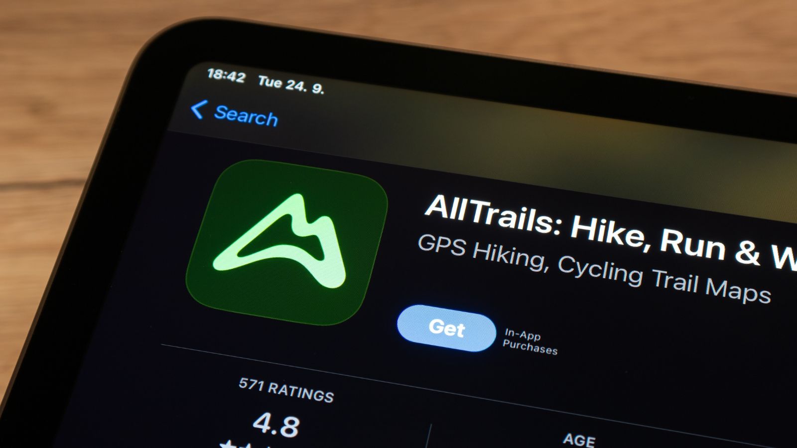
AllTrails won affection by making the outdoors feel legible. For hikers, casual walkers, cyclists, and travelers, it turned unfamiliar terrain into something easier to trust. Trail discovery, reviews, difficulty notes, photos, and navigation tools all helped shrink the uncertainty that keeps many people from trying new routes. It was especially valuable for the kind of person who likes the idea of a scenic hike but not the idea of getting lost halfway through it. In that sense, the app made nature feel more approachable without stripping away its appeal.
The paid tiers sharpen the old question of convenience versus necessity. Offline maps, trail conditions, and planning tools have become central parts of the subscription case, while Peak pushes further with extras such as plant identification and community heatmaps. That matters because outdoor apps do not feel hypothetical when signal disappears. If someone is on a remote trail and wants reliable navigation, the line between premium feature and peace of mind starts to blur. AllTrails still offers plenty to free users, but the stronger the app becomes at solving real outdoor uncertainty, the easier it is for the subscription to stop feeling optional.
Ulysses
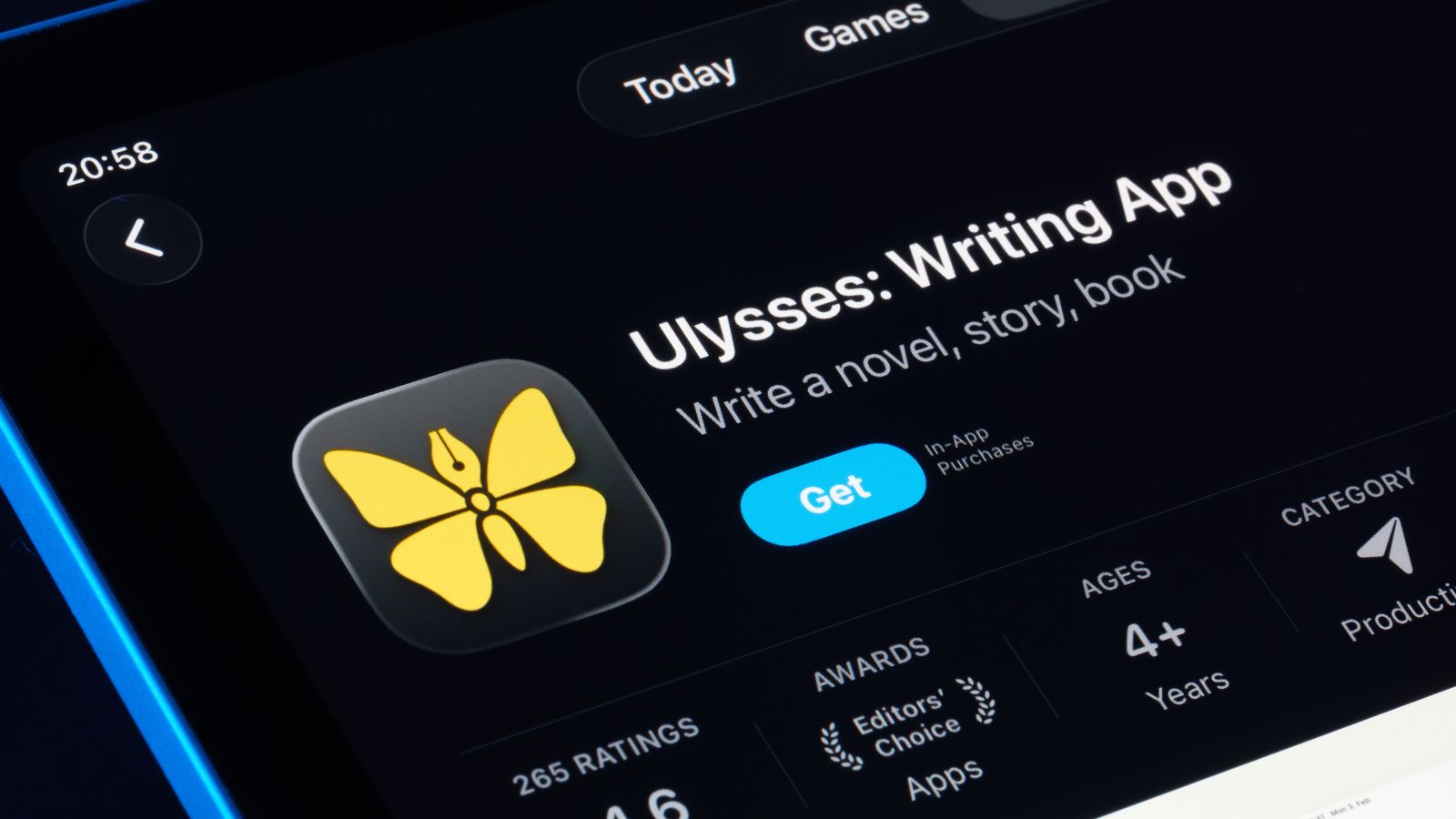
Ulysses has long held a special place among writers who value clean, distraction-light software. It offered a writing environment that felt literary without being pretentious, technical without being cluttered. Drafts, notes, exports, and project organization all came wrapped in a design that seemed to understand how fragile concentration can be. That made it easy to love. For the kind of writer who spends hours inside a blank page, a tool that reduces friction can feel unusually intimate, almost like a studio rather than a product.
Its move to subscription became a landmark moment in the broader software debate. Ulysses openly shifted to recurring billing years ago, arguing that continuous improvement needed continuous support, and today the app still requires a subscription. That logic is understandable, especially for a niche tool that updates across devices and operating systems. But for writers raised on the idea of buying software outright and keeping it for years, the change carried symbolic weight. It suggested that even the quietest creative tools were no longer exempt from the new economy. The writing app stayed elegant. The payment model, however, became unmistakably modern.
PicsArt
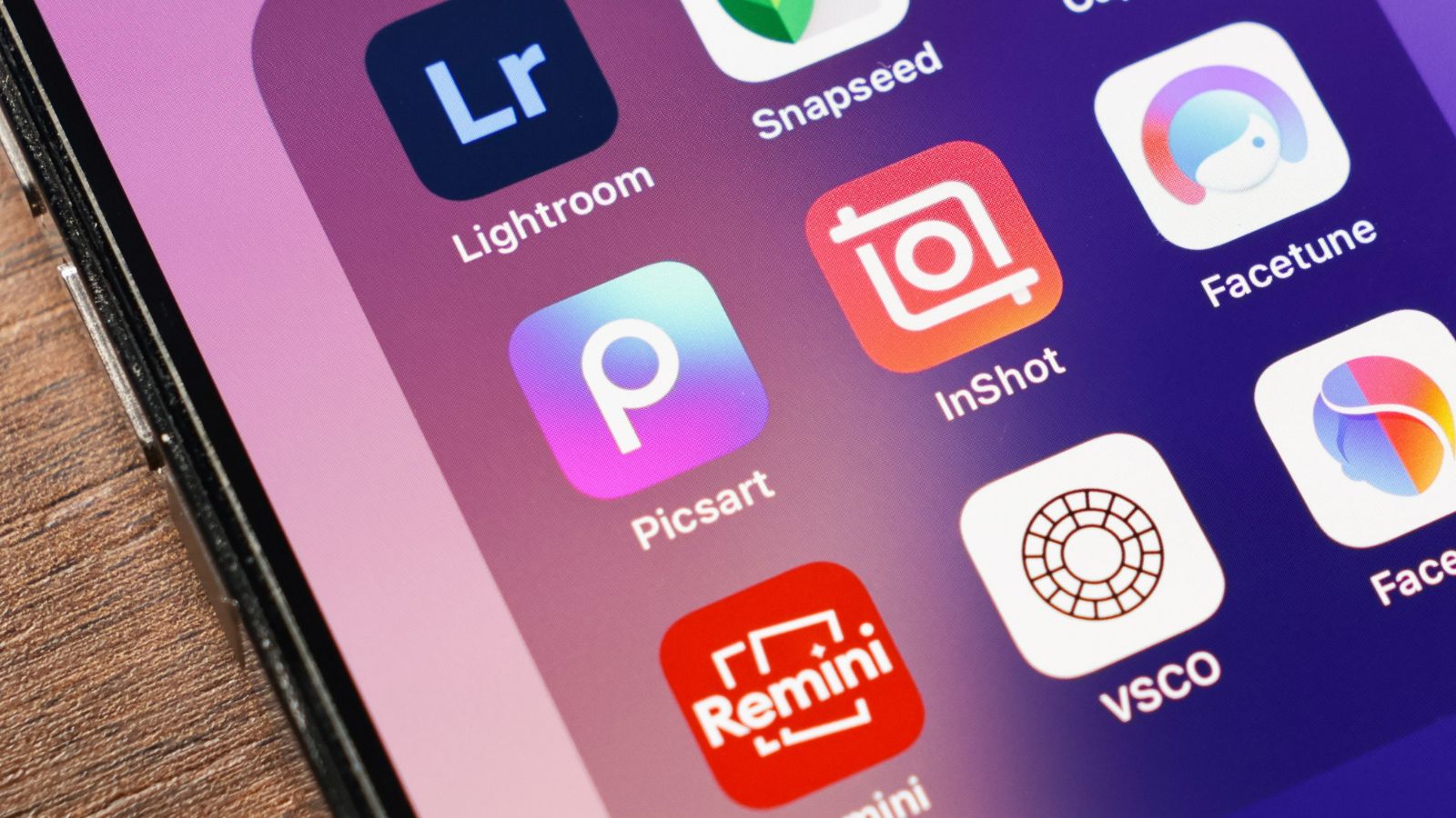
PicsArt grew by being playful. It made editing feel less like professional correction and more like experimentation—stickers, overlays, retouching, templates, collage tools, effects, and later a growing collection of AI-driven creative features. That looseness helped the app spread widely among casual creators who wanted faster, more expressive editing on a phone. It was not just about fixing a photo. It was about turning one into something louder, stranger, or more tailored to whatever visual trend was circulating that week.
That same energy now runs through a more clearly monetized system. PicsArt’s subscription tiers unlock advanced tools, premium assets, more storage, and an ad-free mobile experience, which means the app’s most polished creative playground increasingly belongs to paying users. The company launched Gold years ago, and the logic has only expanded since then. For someone making occasional edits, the free version may still be enough. But for users who came to rely on the app as a regular creative outlet, the experience can start to feel familiar in the least surprising way possible: the more imaginative the work becomes, the more likely the subscription prompt is waiting nearby.
19 Things Canadians Don’t Realize the CRA Can See About Their Online Income

Earning money online feels simple and informal for many Canadians. Freelancing, selling products, and digital services often start as side projects. The problem appears at tax time. Many people underestimate how much information the CRA can access. Online platforms, banks, and payment processors create detailed records automatically. These records do not disappear once money hits an account. Small gaps in reporting add up quickly.
Here are 19 things Canadians don’t realize the CRA can see about their online income.